Heidelberg Theatre Company. Directed by Chris McLean. Designed by Chris McLean. Lighting by Michael Rowe. May 2019.
A View From the Bridge
Arthur Miller’s A View from the Bridge is a classic of the American theatre. The production I was involved with was intended to be an authentic interpretation of Miller’s work and true to its intended style.
Design concept
My core design idea for lighting this work was the physicality of the play. There are recurring motifs of dancing and fighting—and sometimes highly choreographed fighting as a dance. To support this, I emphasised side and back light in the design, almost in the way you would approach a dance piece. My idea was to model the actors’ movements and bodies, and allow the relatively low level of front light to create dramatic shadows on faces.
The other motivating concept of my design was the use of colour. While Miller’s message of loyalty, love, and betrayal are timeless, this was very much a period piece. I used muted tones with an emphasis on almost sepia-like colours to help establish the setting in mid-20th century Brooklyn.
Highlights
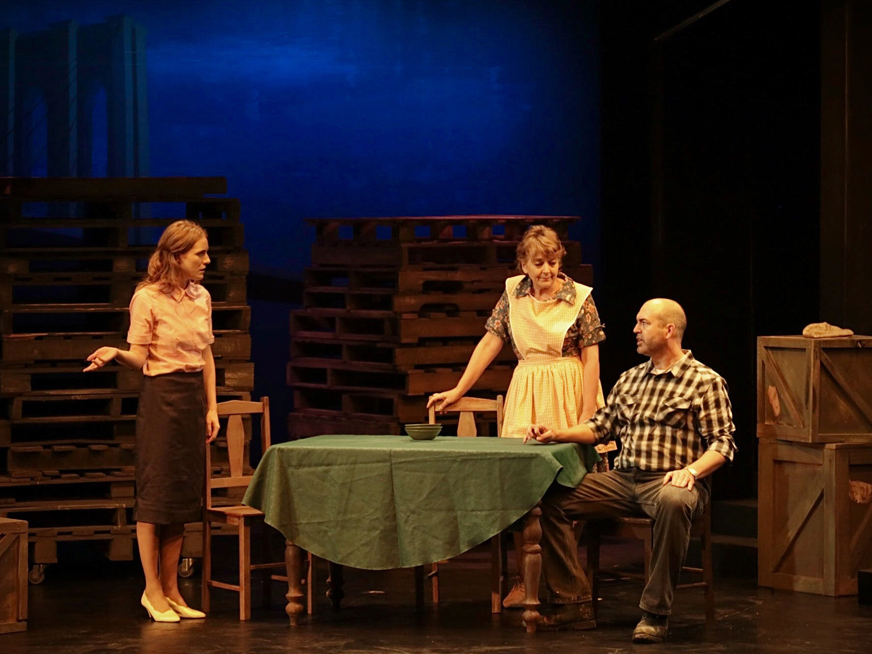
Warm, homely feel of the Carbone’s apartment
The strong sidelight, a mix of Lee 201 (daylight CC) and L102 (yellow), created a feeling of a small, cosy apartment, and the balance between these two colours allowed me to change the mood to suit the shifting emotions of the play.
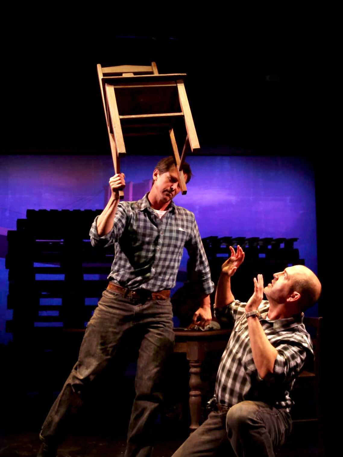
Climax of Act I – Marco easily lifts the chair over Eddie’s head
I used a pair of Ovation E-910 LED profiles as sidelight in a very intense, almost purple, colour to create a brief tableaux of the moment Marco demonstrates his inhuman strength and advantage over Eddie.
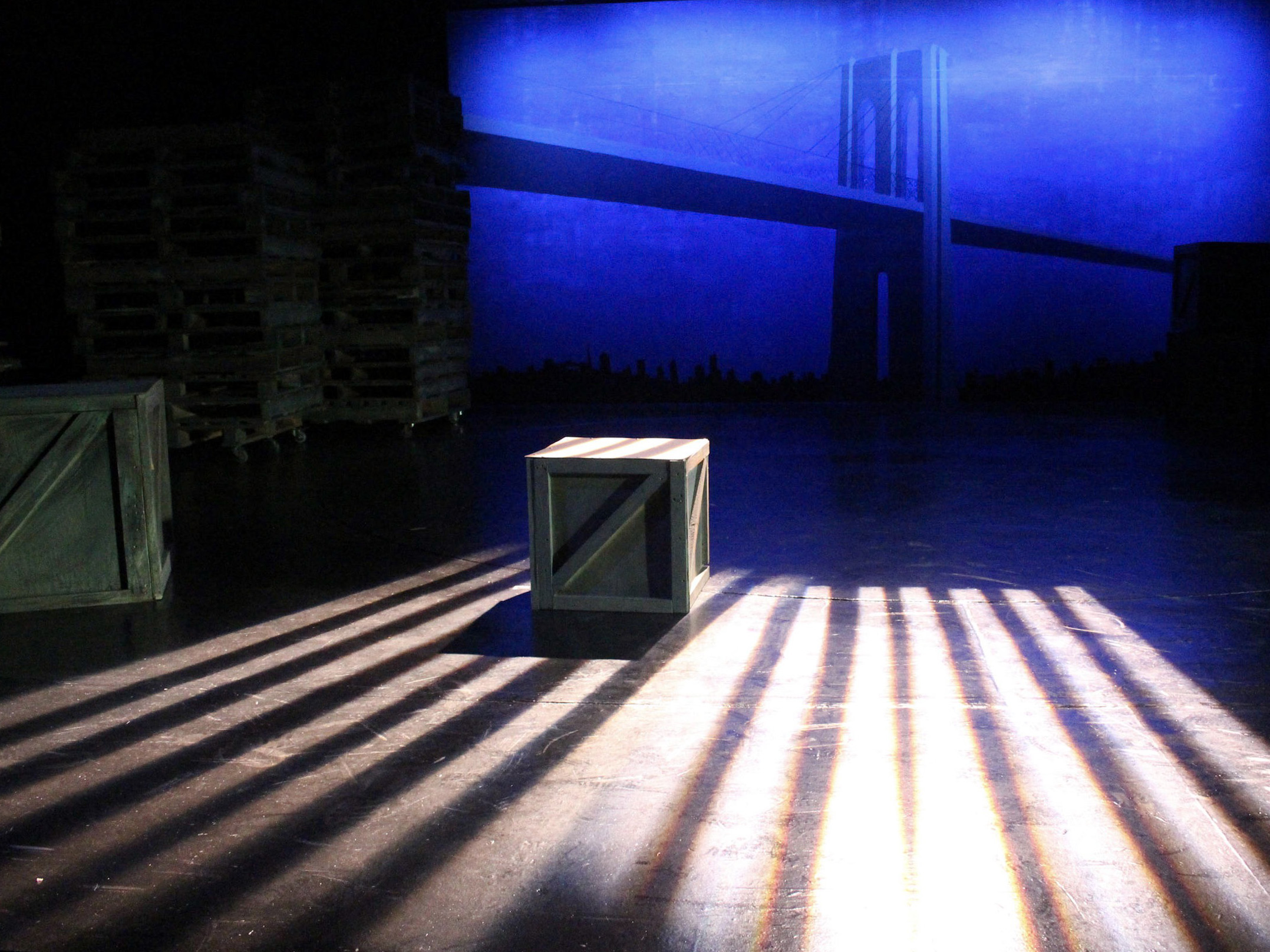
Colour and variation of the scenic cyclorama
The back wall of the stage was painted to represent the New York skyline, with the eponymous bridge in a strongly linear design. I worked with the scenic artist to ensure the predominantly blue wall included enough red pigment so that I could use two banks of ColorBand HEX9 LED strips to produce a wide variety of images, from having the bridge almost fade away to it almost leaping off the wall and into the foreground.
Potential improvements
There are a few places where my design fell short, in either conception or execution.
The sparse set was dominated by five stacks of wooden pallets that were moved around the stage to create distinct scenes. I attempted to use LED PARs on each of these to provide variations of colour and shape. The execution of this idea fell short due to the rigging positions/angles I chose for the units, and I ran out of time to fix this. While the ability to colour these pallets to suit each scene was effective, it could have added a lot more to the feel of the show with better modelling.
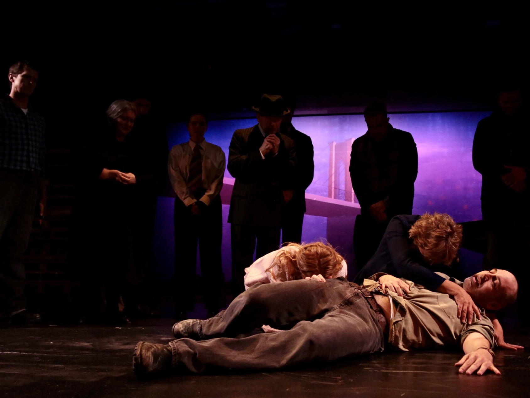
I completely failed to conceive a suitable design for the climax of the play, Eddie’s death in front of a gathered crowd of family and onlookers. It ended up looking quite plain, and a disappointing finale. I actually realised what a should have done while sitting in the audience watching the show on opening night… very frustrating!
Finally, some of the more rapid and complicated transitions (e.g. Marco’s return to Eddie’s house and the subsequent fight on the street) were hastily plotted, and a little sloppy.